Project Details
Neorise, a software development business based here in Perth got in touch to discuss the
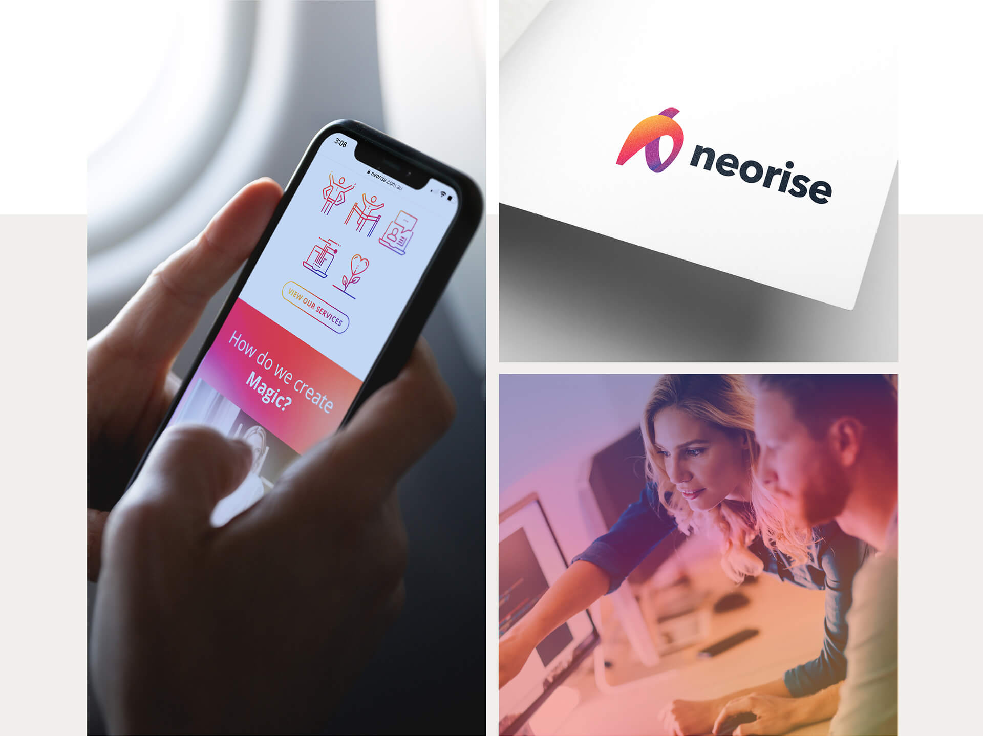
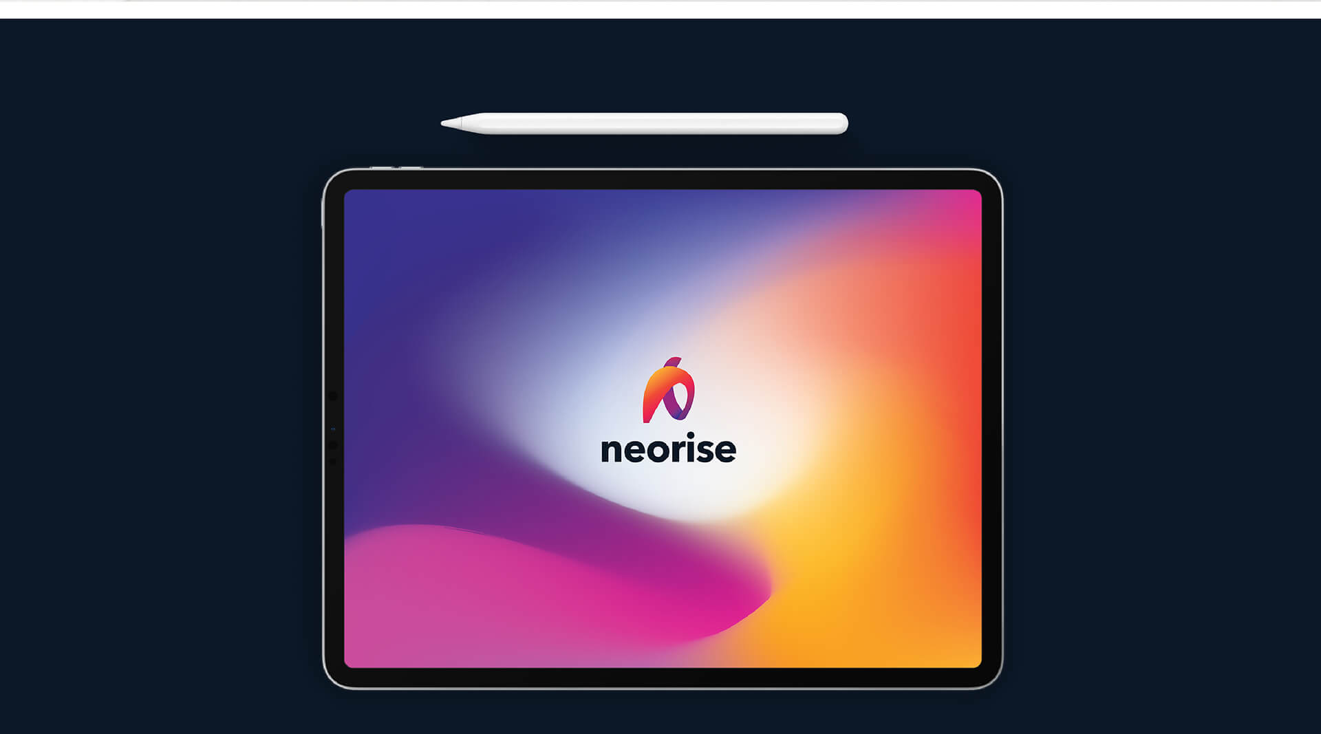
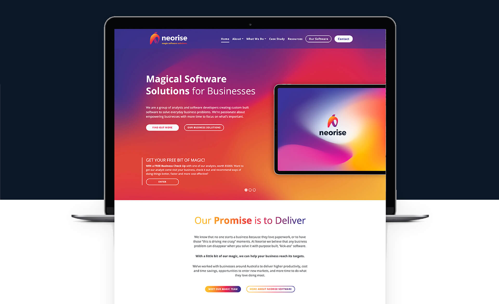
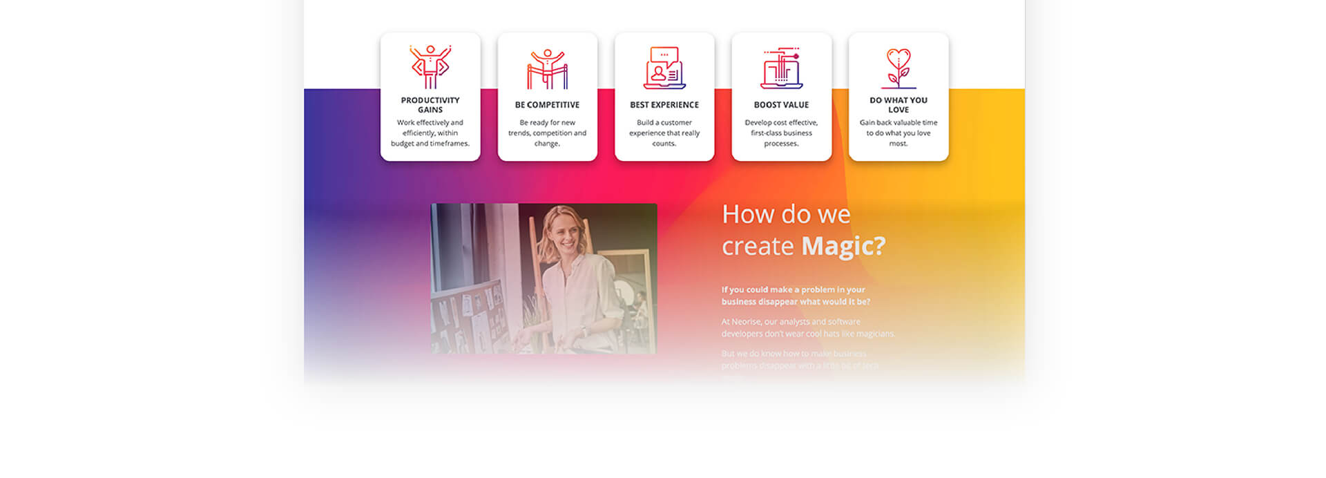
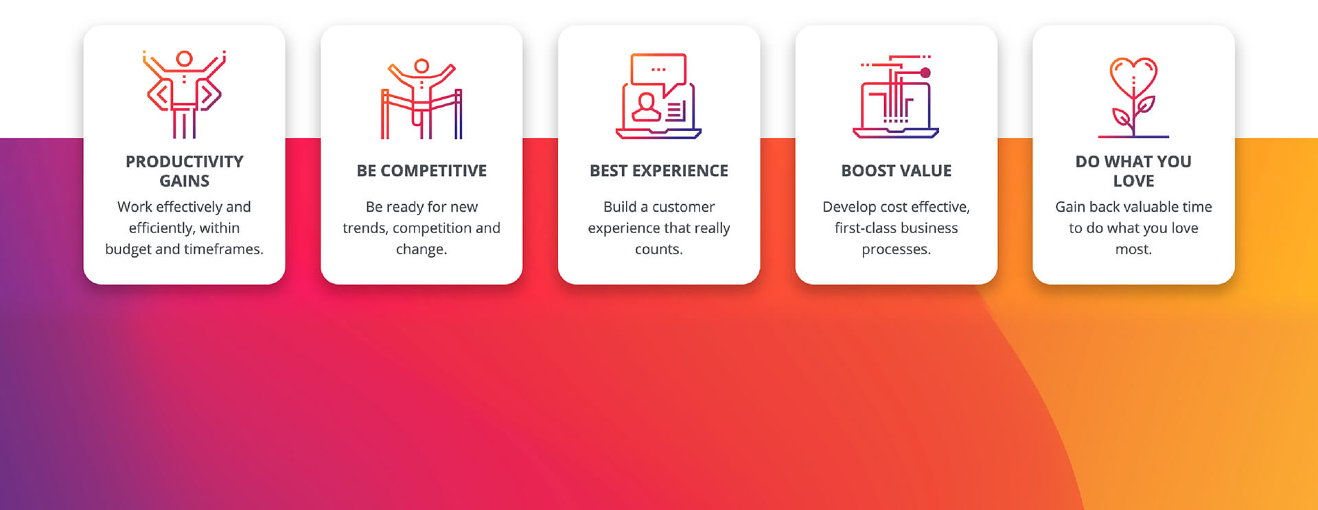
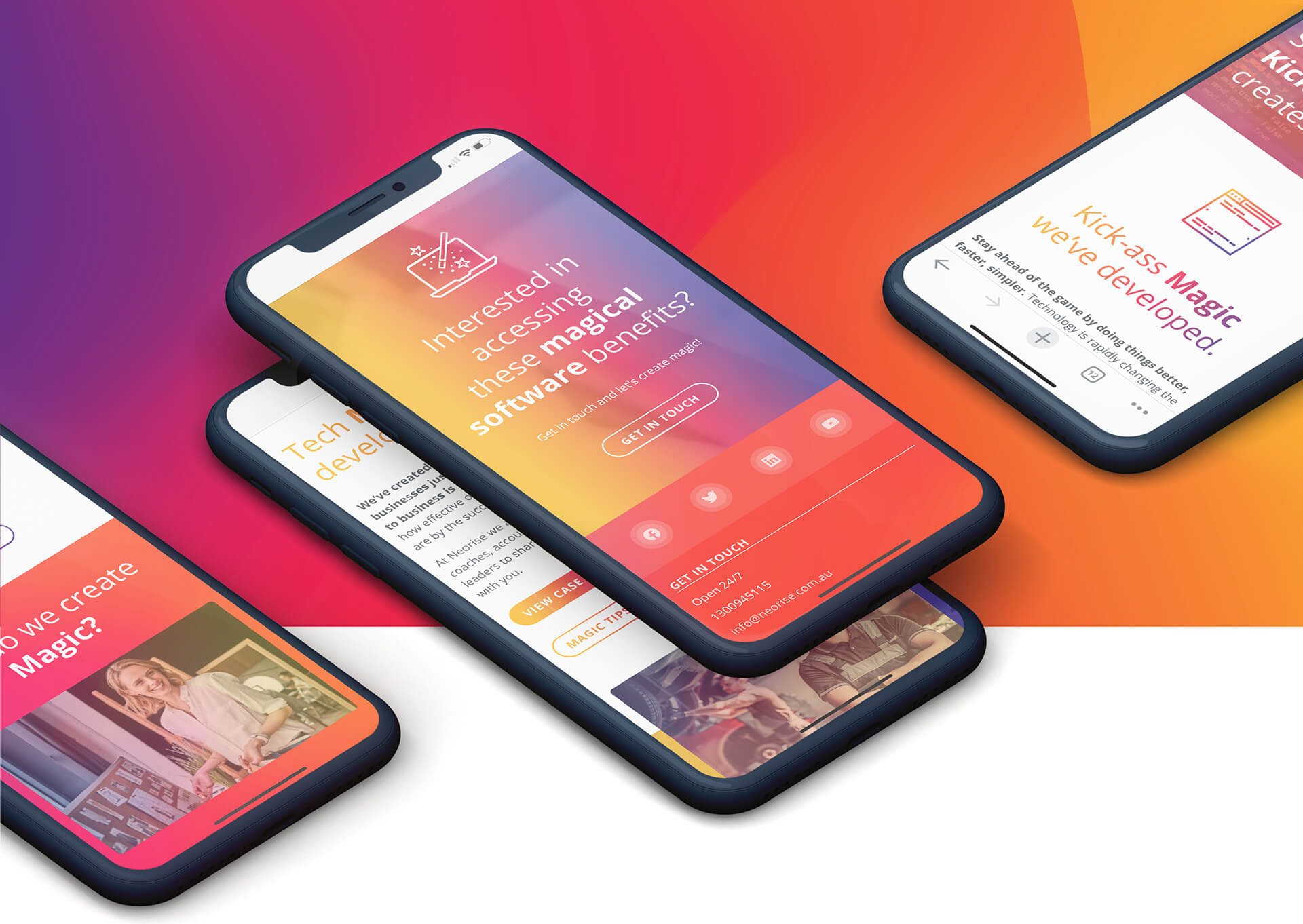
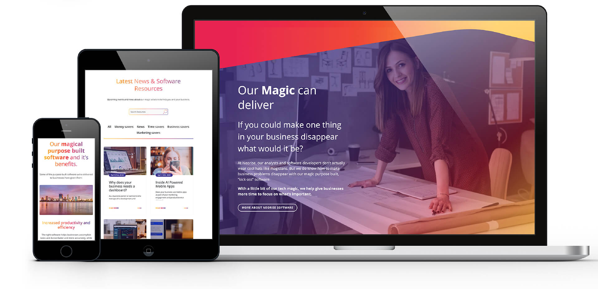
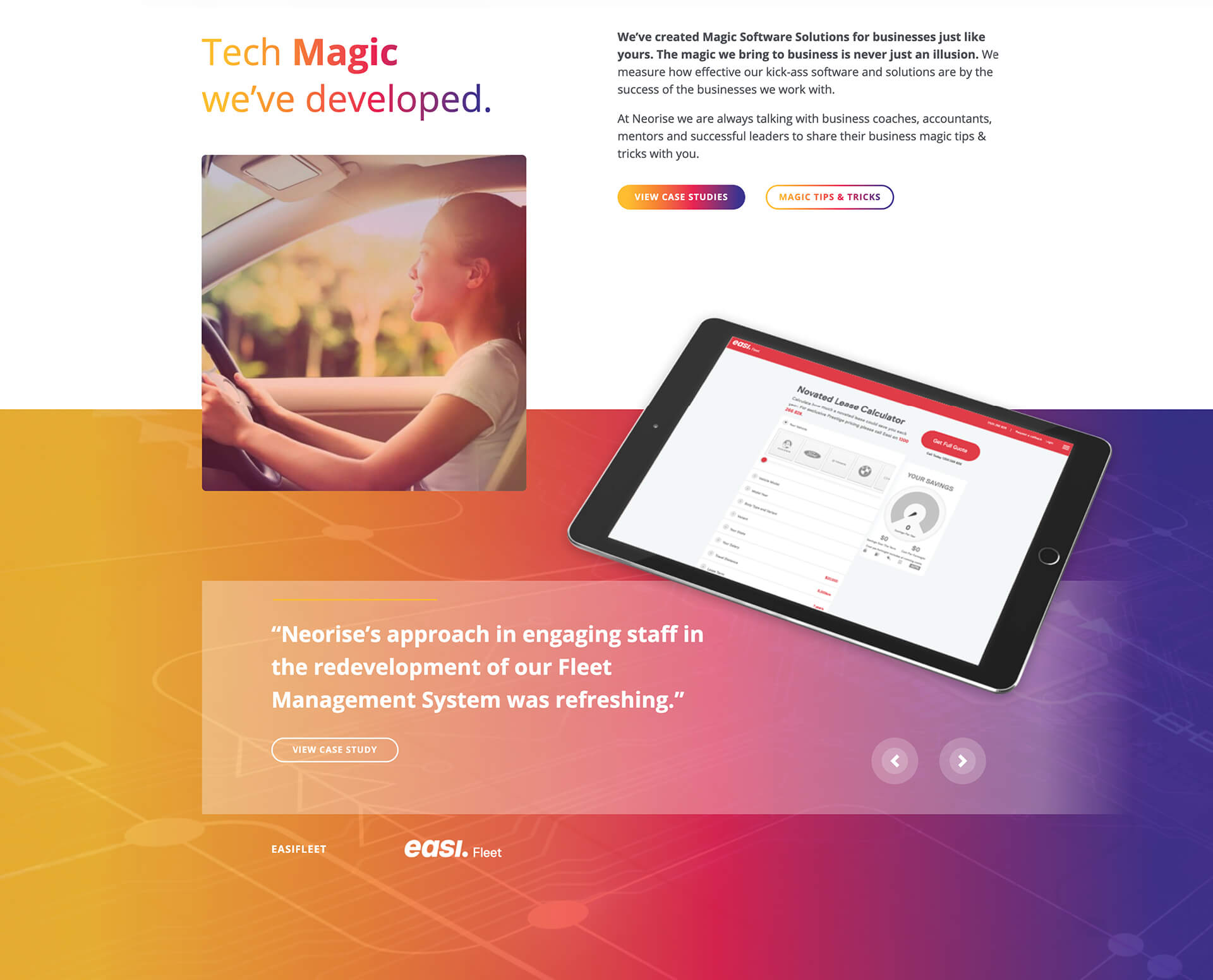
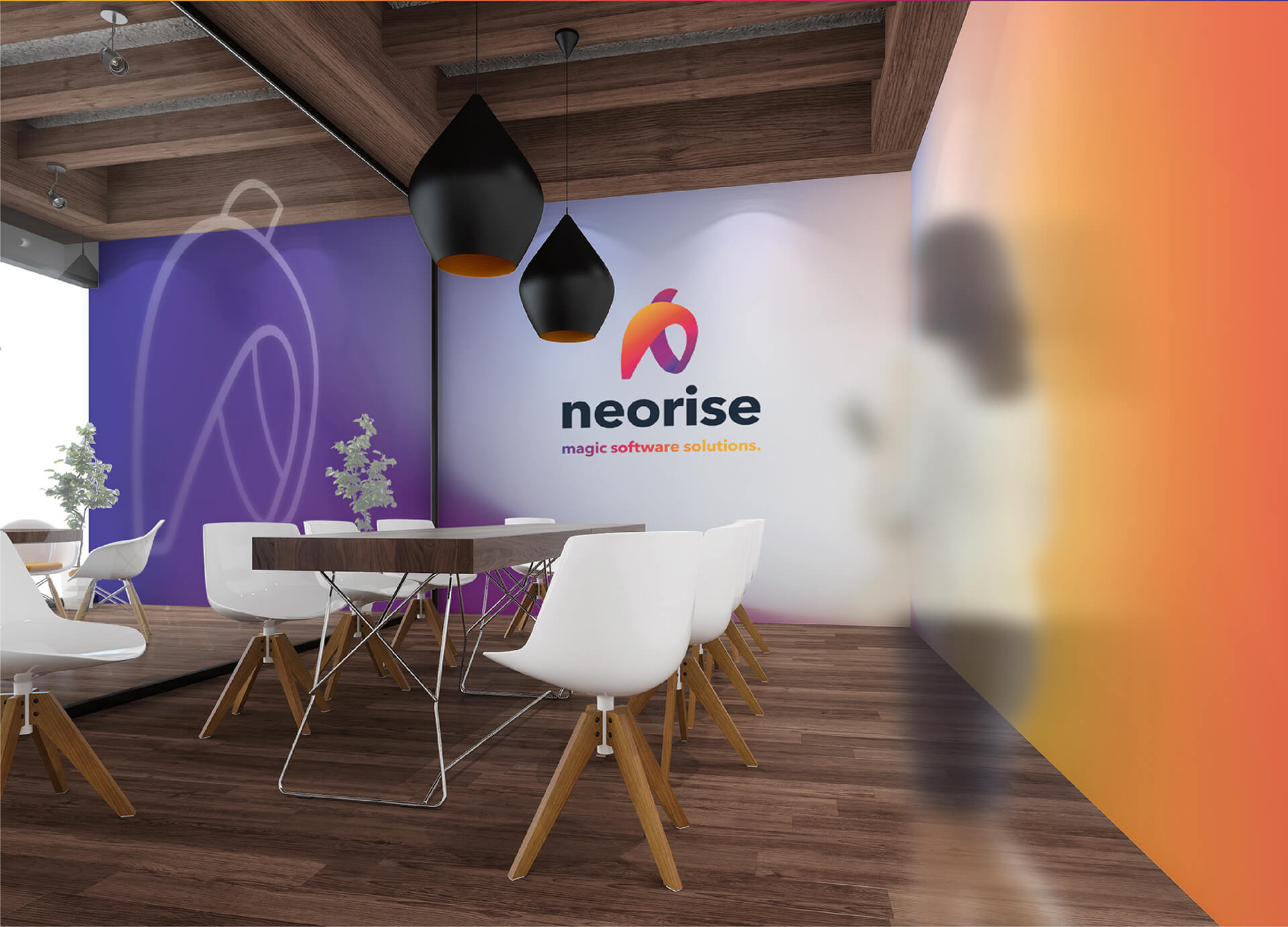
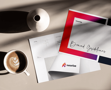
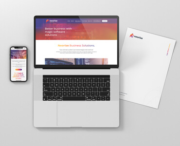
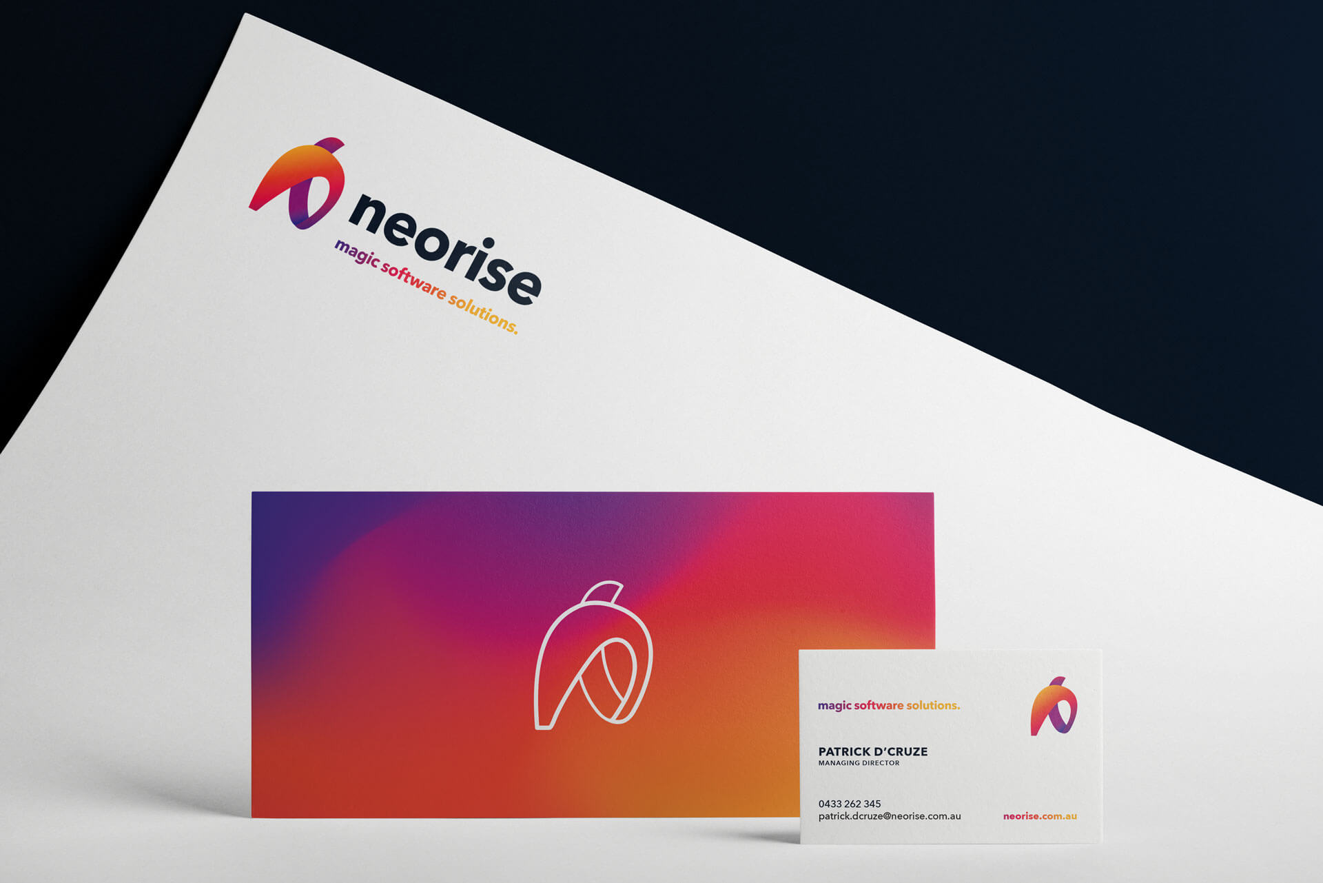
redevelopment of their brand, requesting; logo, style guide, website design, suite of icons and proposed photography in line with new proposed colour palette, which was ‘to reflect our Western Australian heritage and unique environment of resource rich orange soil, bizarre pink salt lakes and magical purple sunsets over the blue ocean.’ Neorises brief was also to bring the ‘magic’ they do for business into their own brand. Their business pitch: At Neorise, our analysts and software developers don’t wear cool hats like magicians. But we do know how to make business problems disappear with a little bit of magic.
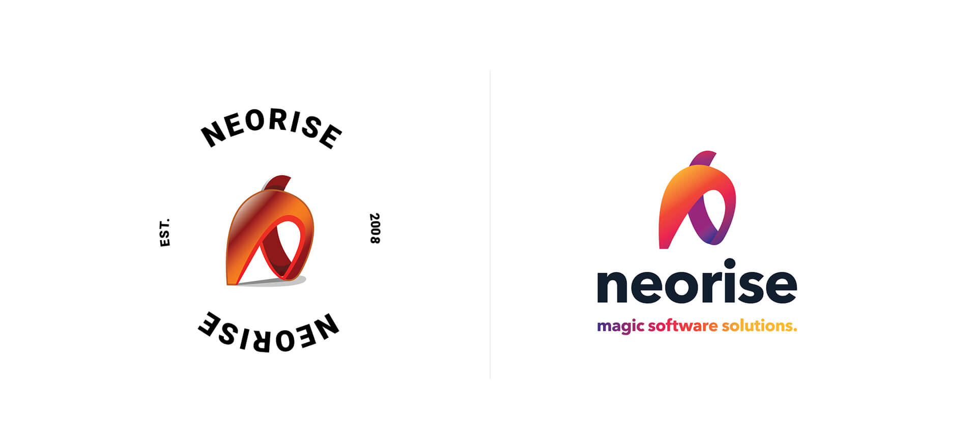
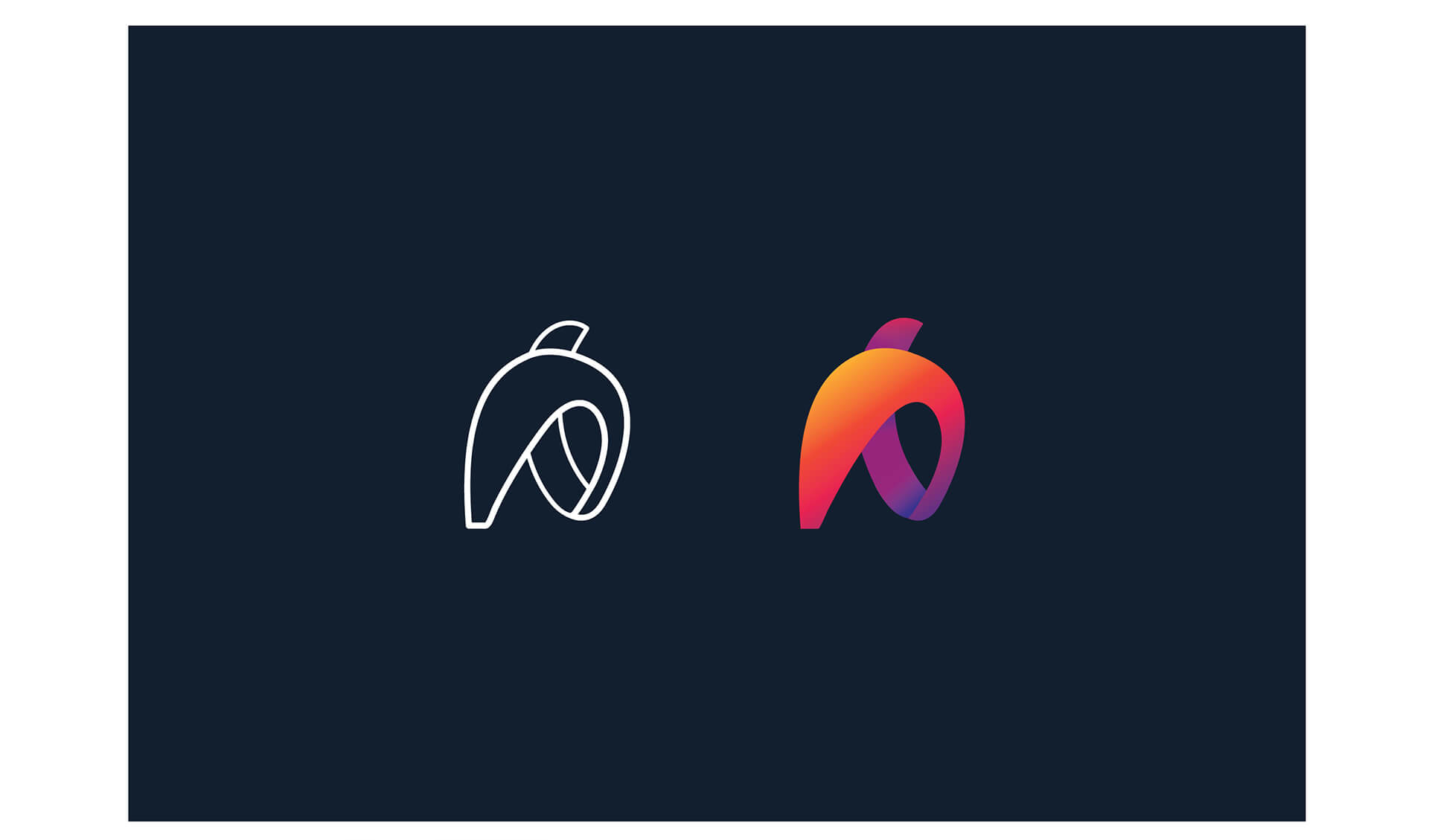
With the existing logo being designed 11 years ago, the task for the designer at the time was to create something ‘abstract’. As inspiration technical director Patrick D'Cruze gave examples of sculptures from an Australian artist - Robert Hague that he loved. Their excellently detailed brief was extremely helpful so it was TL Design Co turn to create some ‘design magic’! We focused on reworking/developing a bright, bold, fun identity that complimented the transformative nature of the brand through the new colour spectrum, and the result? Well, happy clients who reply like this says it’s all: First off a massive thank you!! To quote Patrick "just WOW" What an awful lot of work and it looks amazing. We could not be more thrilled. I was saying to Petra today that I love giving no feedback. So we have no feedback on the design - we love it!
