Project Details
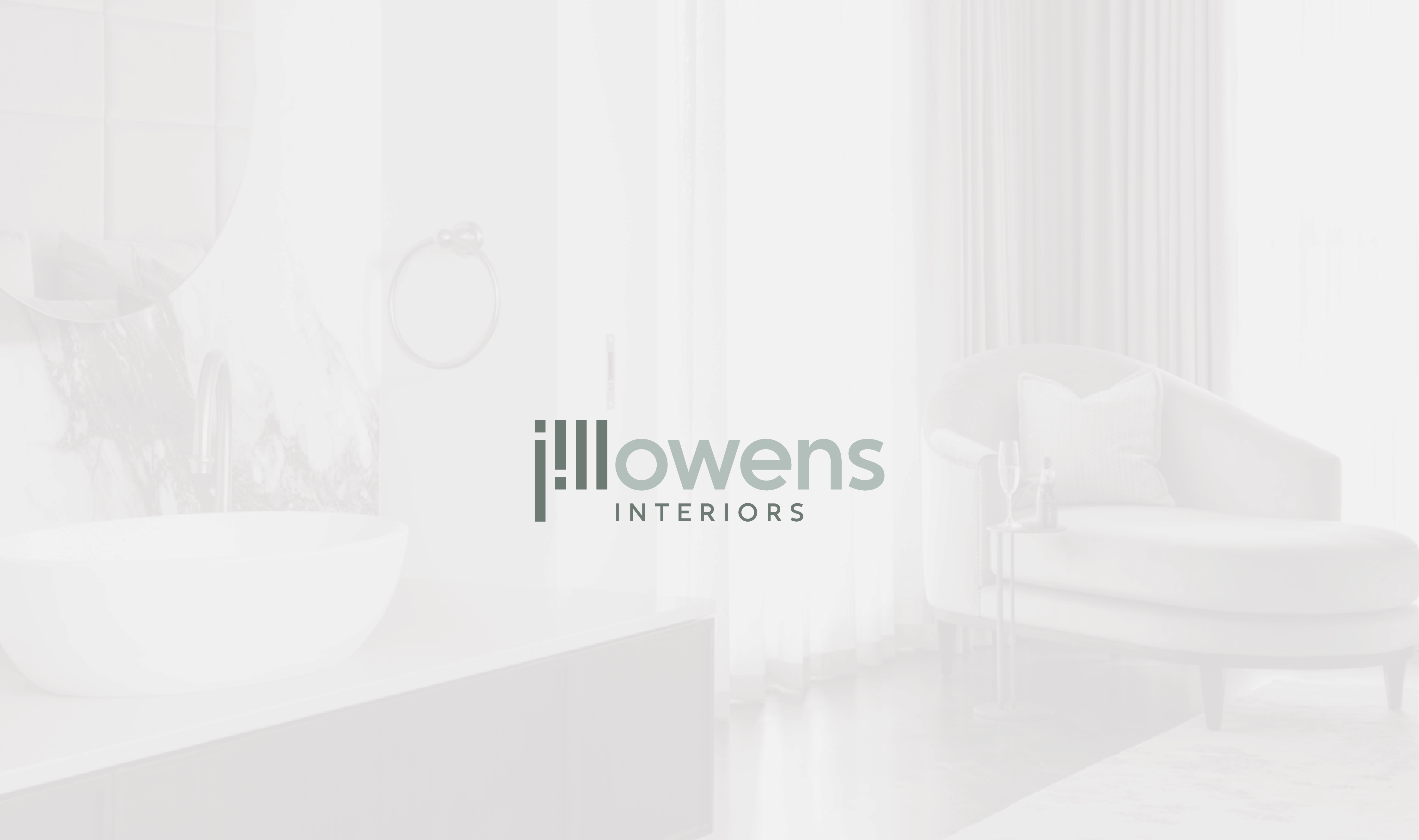
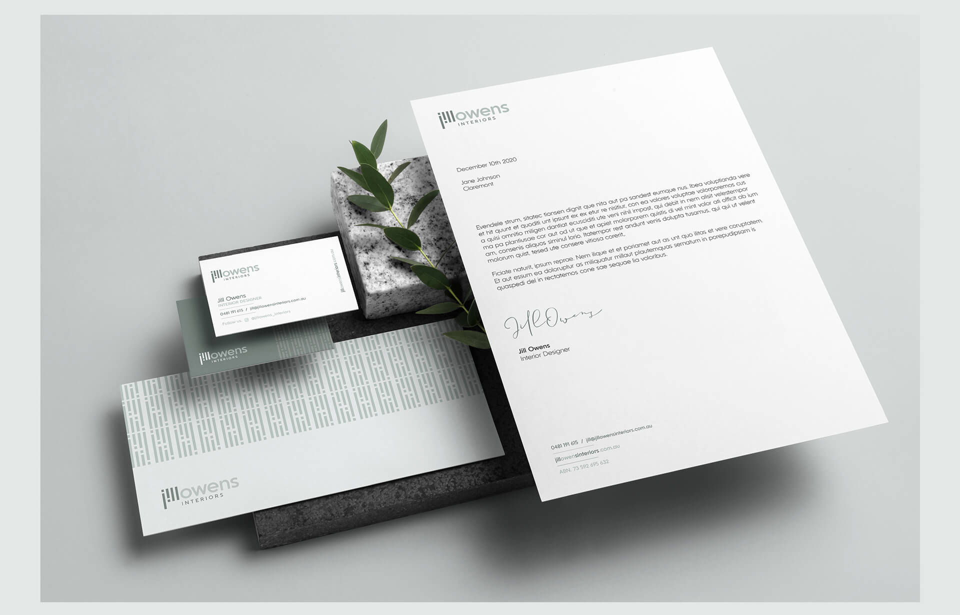
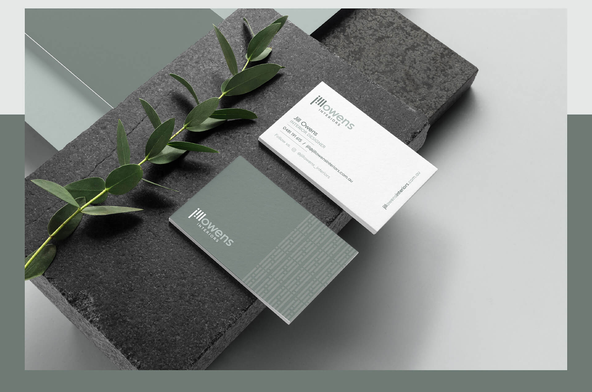
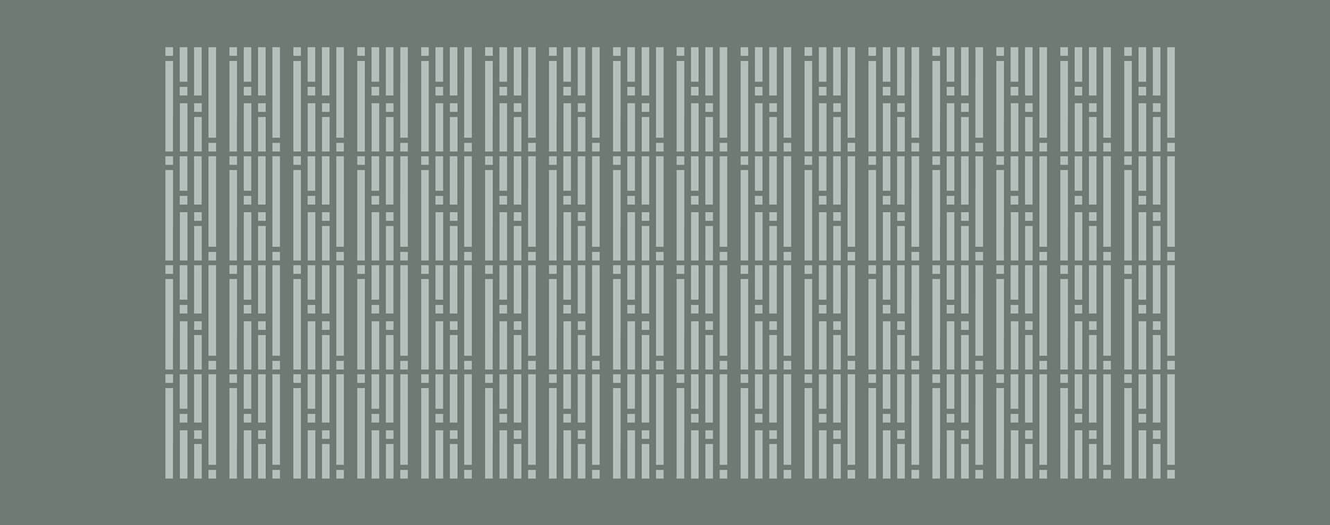
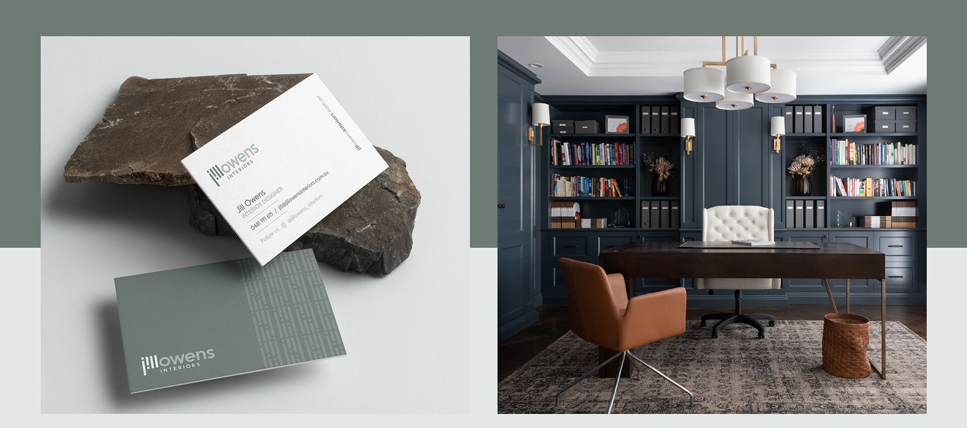
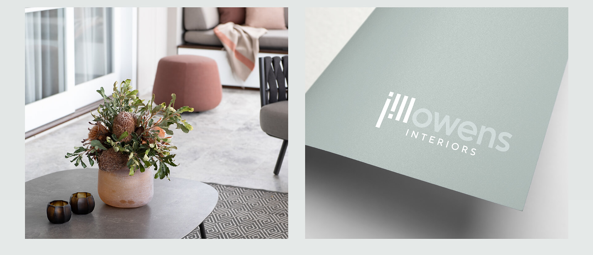
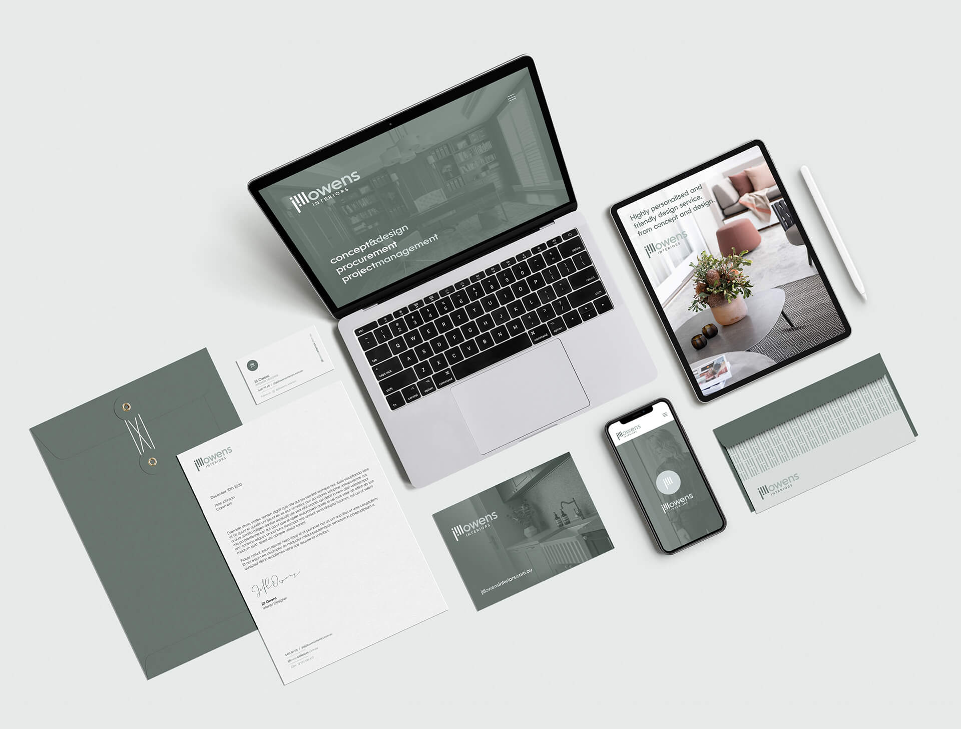
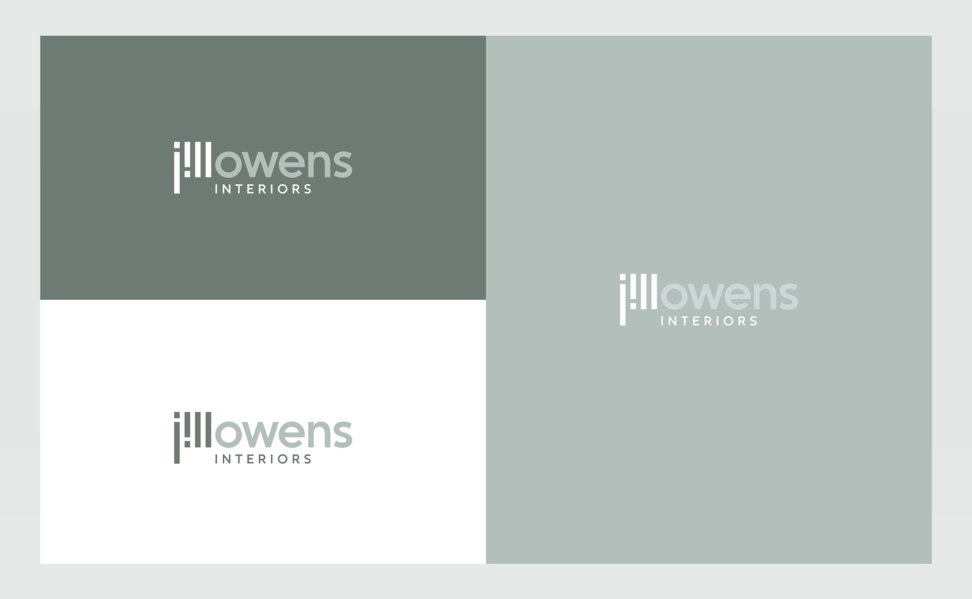
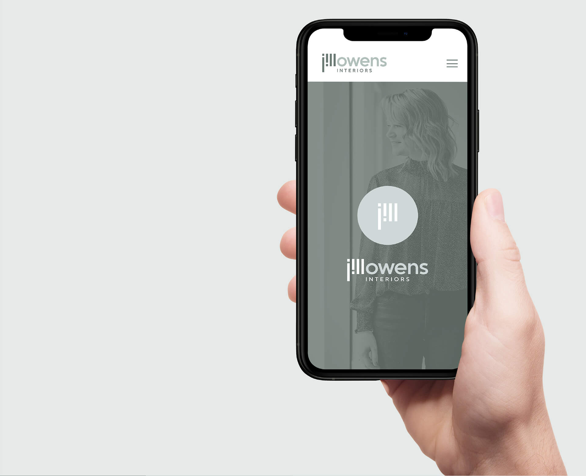
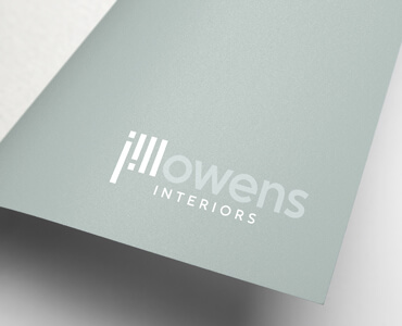
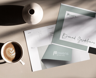
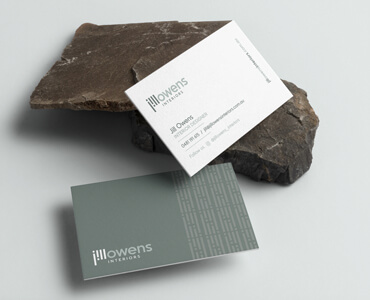
Jill found me on Instagram and after reading through her design brief, and a ‘good old chat’ we knew she loved her existing logo and its colour but no one could pronounce her business name ‘Alhambra Interiors’; so she needed to rename/rebrand to Jill Owens Interiors. The challenge, in a nutshell, was ‘same same but different’. However, I didn’t want to just recreate her logo with the new name, I wanted to explore and develop a new brand identity around her name to reflect her personal style. Jill mentioned her clients said she is professional, organised, patient and a problem solver, they also just call her 'Jill' and this is how she is just known due to clients struggling with the pronunciation of Alhambra. The concept around the design is drawn from her existing logos colour palette yet expanding it a touch for brand flexibility and I wanted to focus on (and have some fun) with the ‘Jill’. So to create a focal point on her name I played with the ‘i’, and by fading back the 'Owens' a touch it emphasises ‘Jill’ making it a Wordmark in its own right. The identity design flowed into sub-brand ideas allowing future development possibilities, and a pattern to use on stationery and maybe one day wallpaper! I love the part of my job where I may not even get to meet the person but I feel like I know them! Jill mentioned to me ‘Do you see how often I use exclamations marks, it's one of the reasons I like your logo so much, reminds me of my love of exclamations!!!’ ... Funny thing is… I didn’t! It must have been subconsciously or just meant to be.


Brand Strategy
Brand Creation
Brand Activation