Project Details
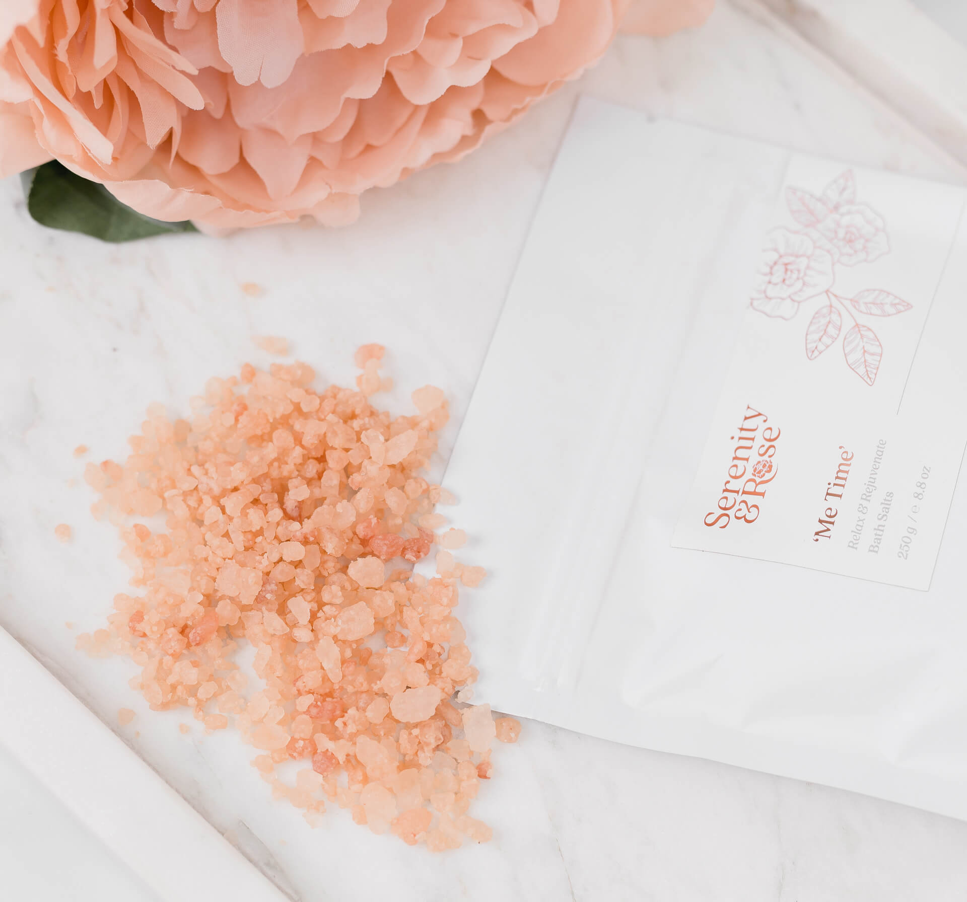
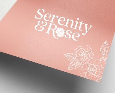
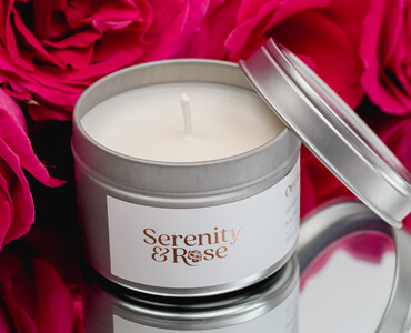
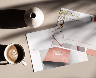
I absolutely loved working on this project with Sharon of Serenity & Rose. The overall look and feel is romantic, gentle, and evokes a soft/pure aesthetic; whilst ‘I feel’ still sophisticated, elegant, and classy! Each product is handmade by Sharon with love and attention, and each ingredient is thought about to make sure that there is an overall benefit, whether that be physical or emotional. I felt incorporating the 'Rose' within the Wordmark was important, it has a special meaning for Sharon and I've used a sketched rose with an 'English garden feel' as a secondary graphic and strategically placed it in different locations to work with the packaging/bottles to make each a little unique. We created a suite of logo variations to allow for flexibility and future growth; and overall developed packaging for her Candles, Body Oil and Bath Salts, Shipping Box, Business Cards, and, of course, a Website to match. Do check out this fabulous lady, her business...
Brand Strategy:
- Logo, Branding Design
- Brand, product & packaging execution
Brand Creation:
- Packaging, Label Designs
- Business Cards
- Packaging design
- Shipping Boxes
- Website Design & Build
Brand Activation:
- Design & art direction
- Product & packaging design
- Brand Guidelines